La Petite Colline Brand Identity
La Petite Colline is a Taiwanese artisan bakery and café based in Toronto. Using Canadian stone-milled organic wheat, house-cultivated natural yeast, and freshly prepared ingredients, the brand combines Taiwanese baking expertise with European techniques to present the flavors and craftsmanship of contemporary Taiwanese baking.
Beyond selling bread, the brand seeks to translate familiar Taiwanese food memories: soft shokupan, nuanced sweet and savory flavors, and the everyday ritual of enjoying tea with baked goods, into a contemporary bakery experience that feels approachable and relevant to Toronto’s multicultural audience.
Brand Strategy
The brand brings together three cultural contexts: Taiwanese food culture, European baking traditions, and its development within the Canadian market. The challenge was not to place cultural symbols side by side, but to identify a simple and adaptable idea capable of connecting them.
The identity needed to retain a recognizable Taiwanese character while communicating through a natural, warm, and contemporary visual language—allowing the brand to enter the North American market without being confined by conventional images of Chinese pastries or exoticized cultural aesthetics.
The idea of the “mountain” became the shared symbol connecting the brand’s different languages and cultural influences. The Chinese name, 山山, feels simple, friendly, and rhythmic, while the French name La Petite Colline, meaning “the little hill,” evokes the same image. The layered mountain forms also recall loaves gradually rising through fermentation and baking, representing the depth of flavor created through natural ingredients, time, and craftsmanship.
By connecting the Chinese and French names through a shared visual metaphor, the identity establishes cultural continuity within a single concept. This enables the brand to retain its roots while developing the warmth, accessibility, and recognition needed for an international market.
Design Concept
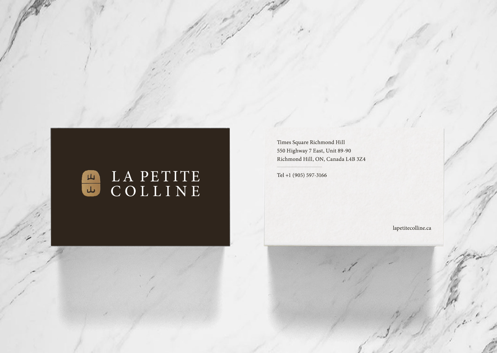
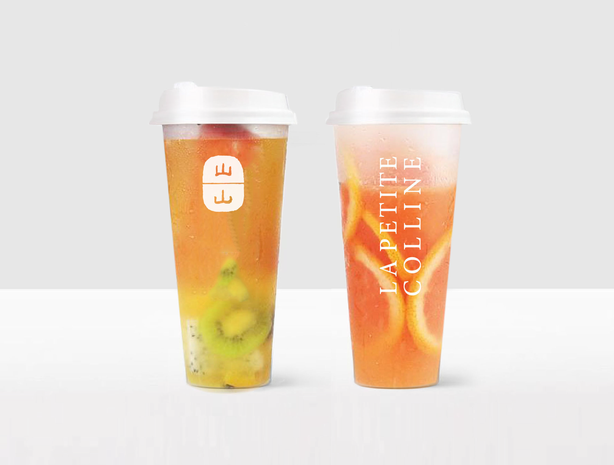
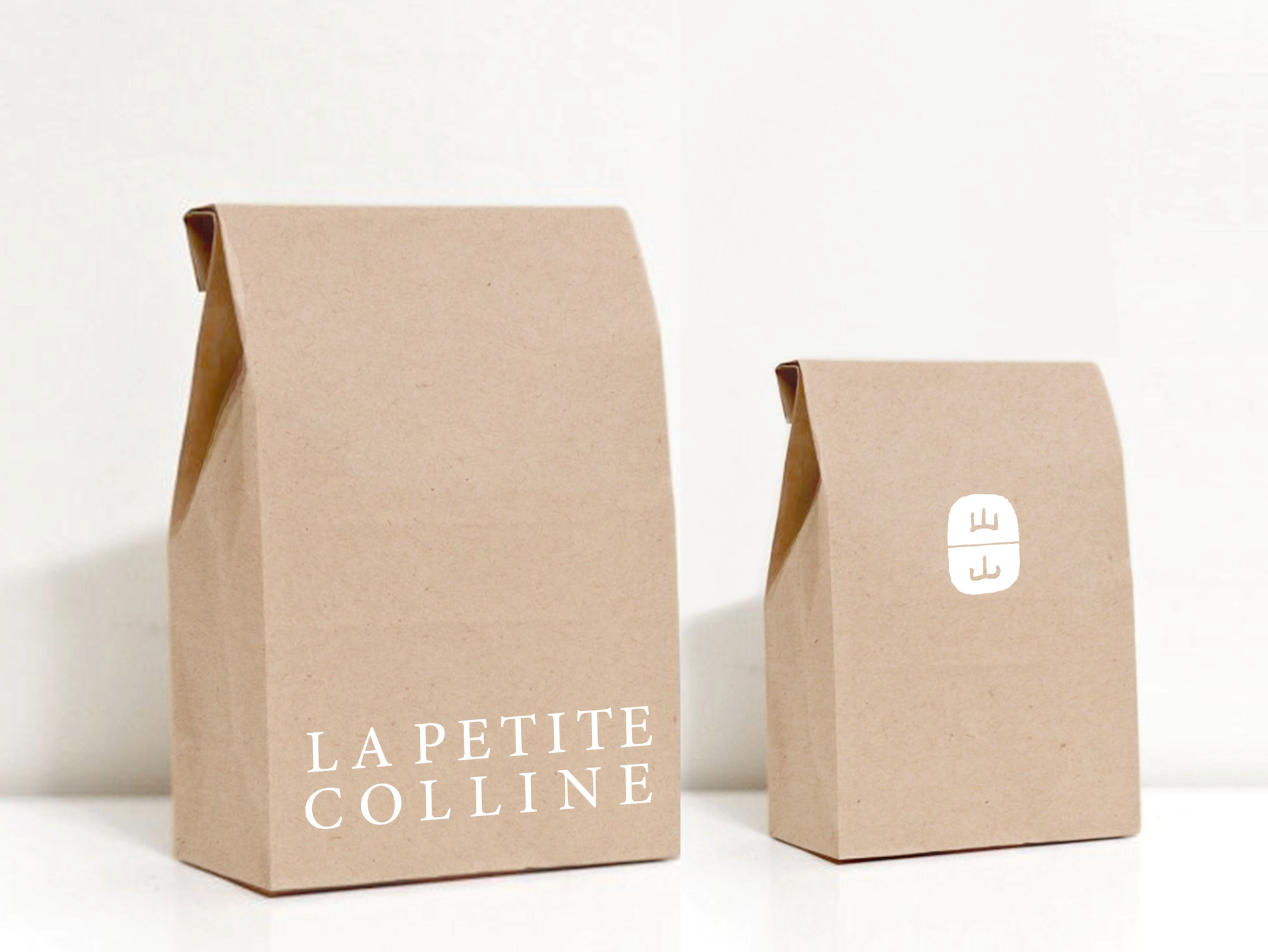
The primary mark draws from the East Asian tradition of seals, transforming the Chinese characters 山山 into a concise, tactile symbol. Beyond expressing the brand’s Taiwanese roots, the seal functions like a maker’s signature—communicating craftsmanship, a commitment to quality, and the individuality of each freshly baked batch.
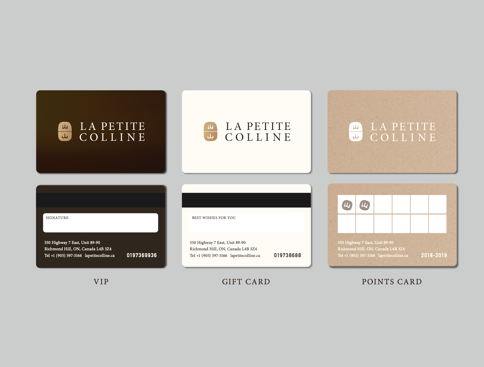
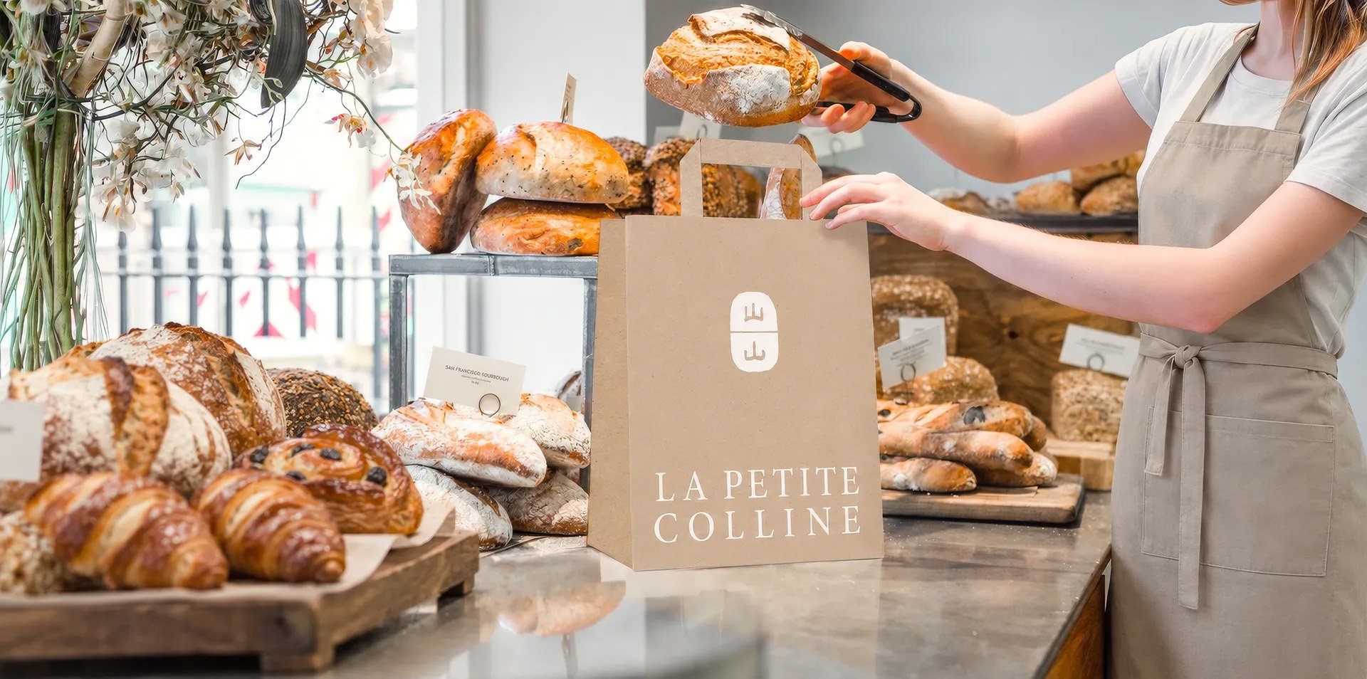
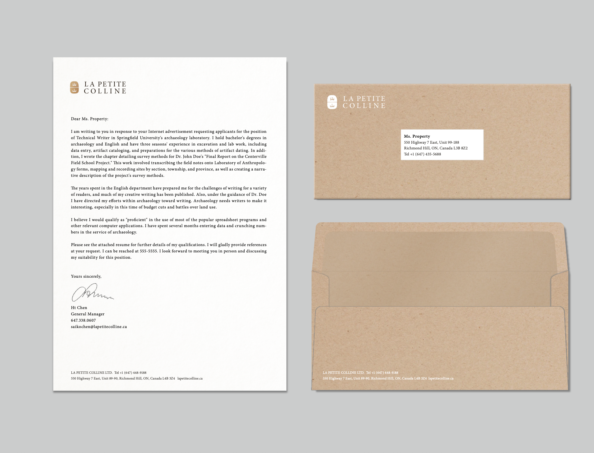
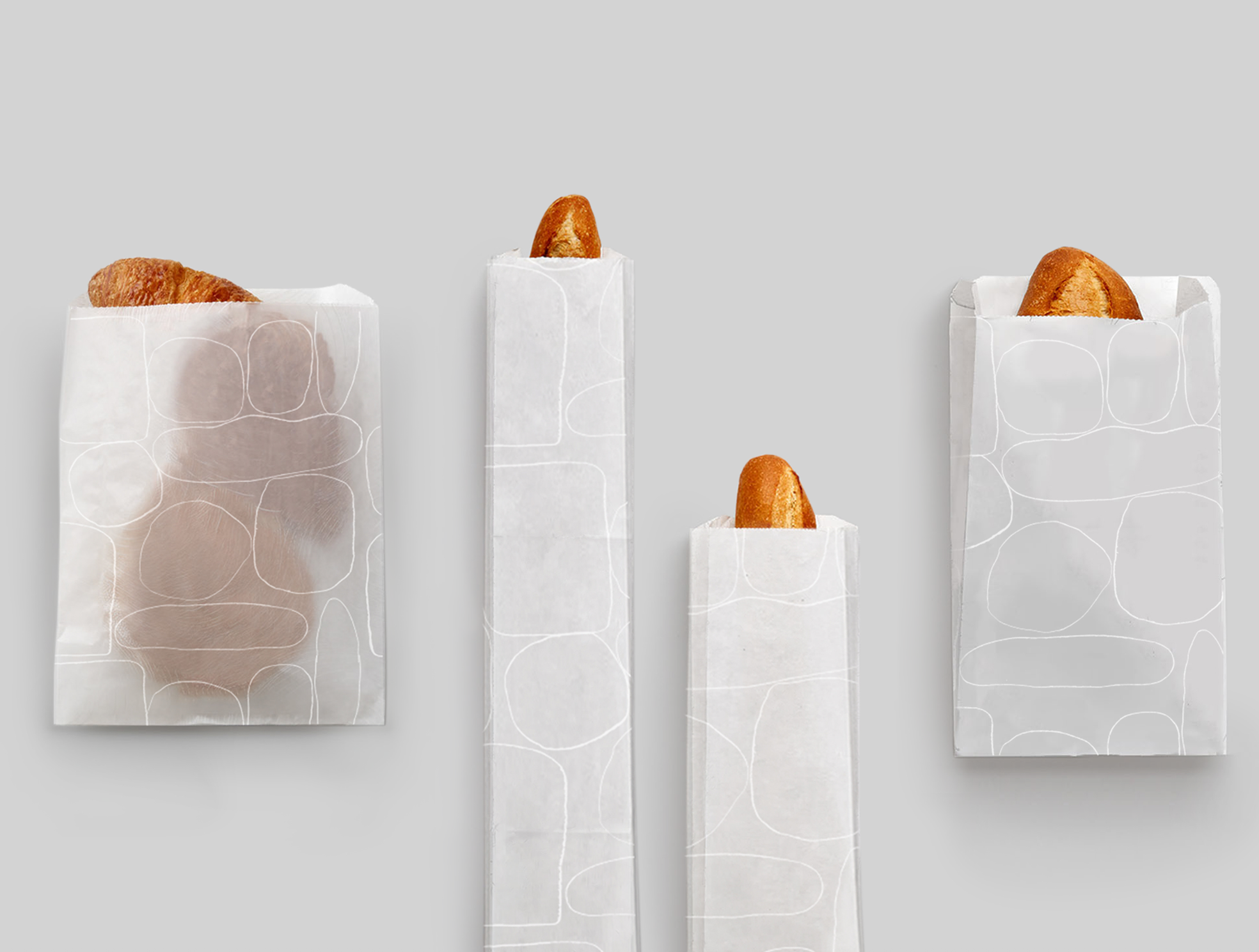
The wider visual system takes inspiration from the materials found in the bakery itself. Natural neutral tones, kraft paper, white baking paper, and uncoated stocks create an identity that feels warm, honest, and understated. Refined typography and generous use of space balance this sense of craftsmanship with contemporary sophistication, allowing the system to extend consistently across bread packaging, in-store materials, and everyday brand communications.
Rather than emphasizing cultural difference through superficial or decorative symbols, La Petite Colline creates a coherent brand experience through its name, mark, materials, and tactile qualities. Together, these elements translate Taiwanese baking culture into a natural, authentic, and contemporary identity that can be understood across cultures.
Art Direction: DM
Design: DM, Ang Bai
Design Agency: EQUALZ DESIGN
以跨文化品牌識別,重新詮釋加拿大市場中的台歐烘焙
La Petite Colline 是位於加拿大多倫多的台式手作烘焙與咖啡品牌,以加拿大石臼研磨有機小麥、自家培養的天然酵母及每日新鮮製作為核心,結合台灣烘焙經驗與歐式製程,重新呈現台式麵包的風味與質感。
品牌不只販售麵包,也希望將台灣人熟悉的飲食記憶:柔軟的生吐司、豐富而細膩的甜鹹風味,以及茶與烘焙相伴的日常,轉化為多倫多消費者也能理解與親近的當代烘焙體驗。
品牌策略
品牌同時承載三種文化脈絡:源自台灣的飲食文化、歐洲烘焙工藝,以及在加拿大落地發展的市場背景。設計的挑戰不是將三種文化符號直接並置,而是找出一個簡潔而具有延展性的核心意象,在保留台灣文化辨識度的同時,也能以自然、溫暖且當代的語言進入北美市場,避免品牌被侷限於傳統中式糕餅或異國風格的刻板印象。
品牌識別以「山」作為跨越語言與文化的共同意象。中文名稱「山山」簡潔、親切且富有節奏;法文名稱 La Petite Colline 意為「小山丘」,讓兩種語言自然指向同一幅畫面。層疊的山形也呼應麵包在發酵與烘烤過程中逐漸隆起的輪廓,象徵天然原料、時間與手工技藝所累積出的豐富風味。
透過中文與法文共享的品牌意象,識別在同一個視覺概念中建立連結,使品牌既保有文化根源,也具備進入國際市場的親和力與辨識度。
設計概念
品牌核心標誌取材自東亞篆刻與印章文化,將「山山」轉化為簡練、具有手感的印記。印章不僅代表品牌的台灣文化根源,也如同製作者留下的署名,傳達手工製作、品質承諾與每一批麵包所具有的獨特性。
視覺系統則從烘焙現場最直接的材料出發,運用自然中性色、牛皮紙、白色烘焙紙及無塗佈紙材,建立溫暖、樸實而不過度裝飾的品牌質感。細膩的排版與留白平衡了手作感與精緻度,使品牌能同時適用於麵包包裝、店內用品及日常溝通。
La Petite Colline 並非以表面的文化符號強調「異國感」,而是透過名稱、標誌、材料與觸感建立一致的品牌體驗,將台灣烘焙文化轉譯為一個自然、真誠且能被不同文化理解的當代品牌。