LE Biomedical Brand Identity
Founded in 2019, LE Biomedical focused on next-generation biodefense and infection risk control during the COVID-19 pandemic. Beginning with medical masks and antiviral melt-blown nonwoven materials, the company explored applications across healthcare, transportation, and public environments.
As global demand for protective solutions increased, the brand needed to communicate its technical capabilities to corporate clients and international markets. The project aimed to build a professional and consistent B2B identity system that could extend across manufacturing, sales, and exhibition environments.
Strategy & Concept
The identity needed to balance medical safety with technological innovation while adapting to touchpoints ranging from product packaging and uniforms to factories, offices, and international exhibitions.
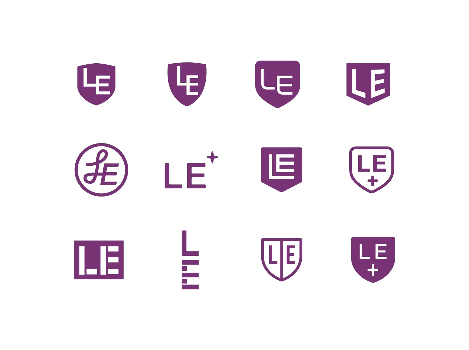
Built around the concept of “Protection through Technology,” the identity draws from the three-dimensional form of a face mask and the protective symbolism of a shield. Its geometric construction reflects the precision of biomedical research, while the inward-folding structure communicates filtration, containment, and protection.
Clear information hierarchies, modular layouts, and a consistent geometric language translate complex biodefense technology into an accessible and adaptable visual system. Rather than relying on conventional medical symbols, the identity establishes a distinctive professional character through structure, proportion, and negative space.
Identity System & Applications
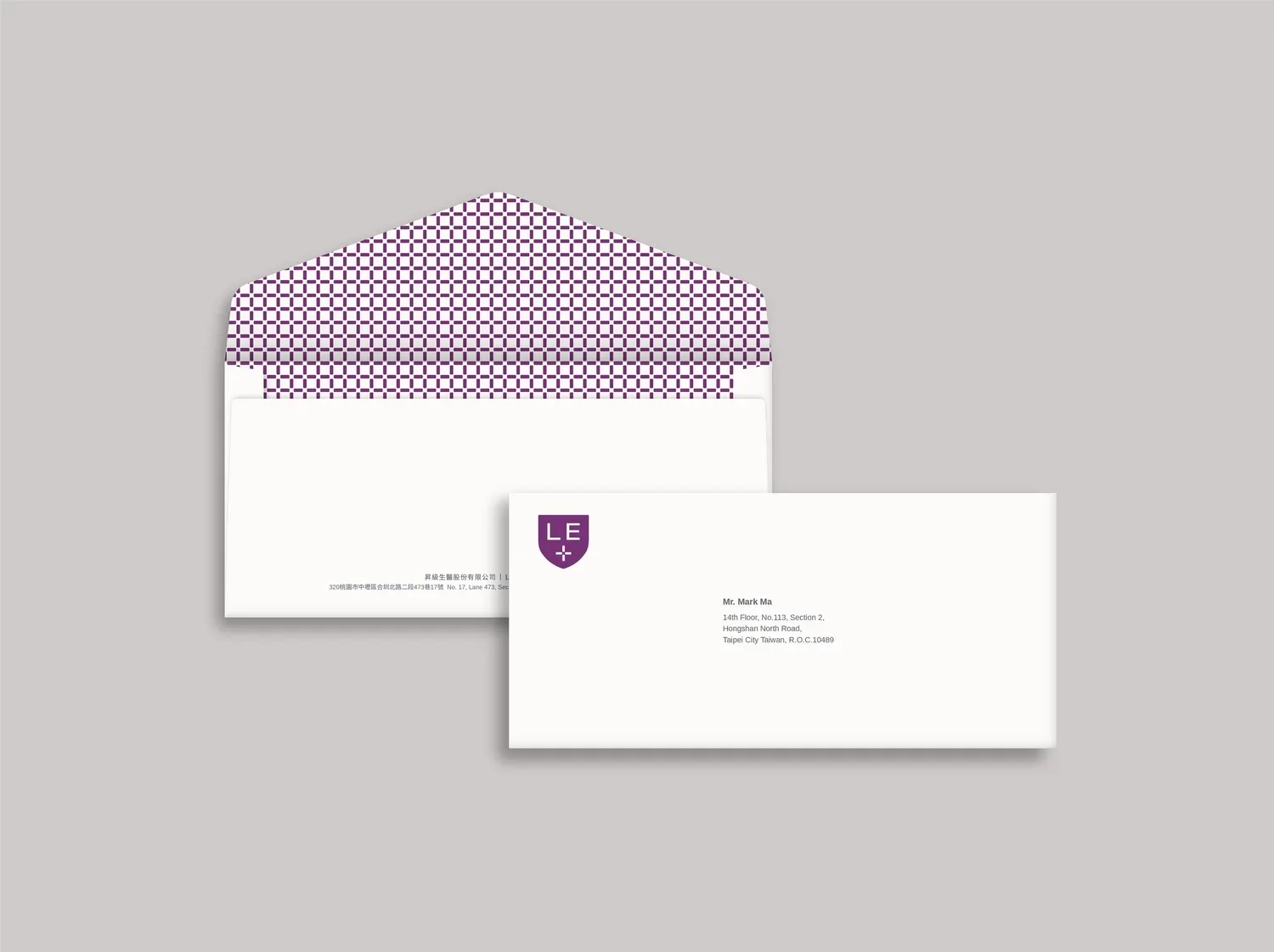
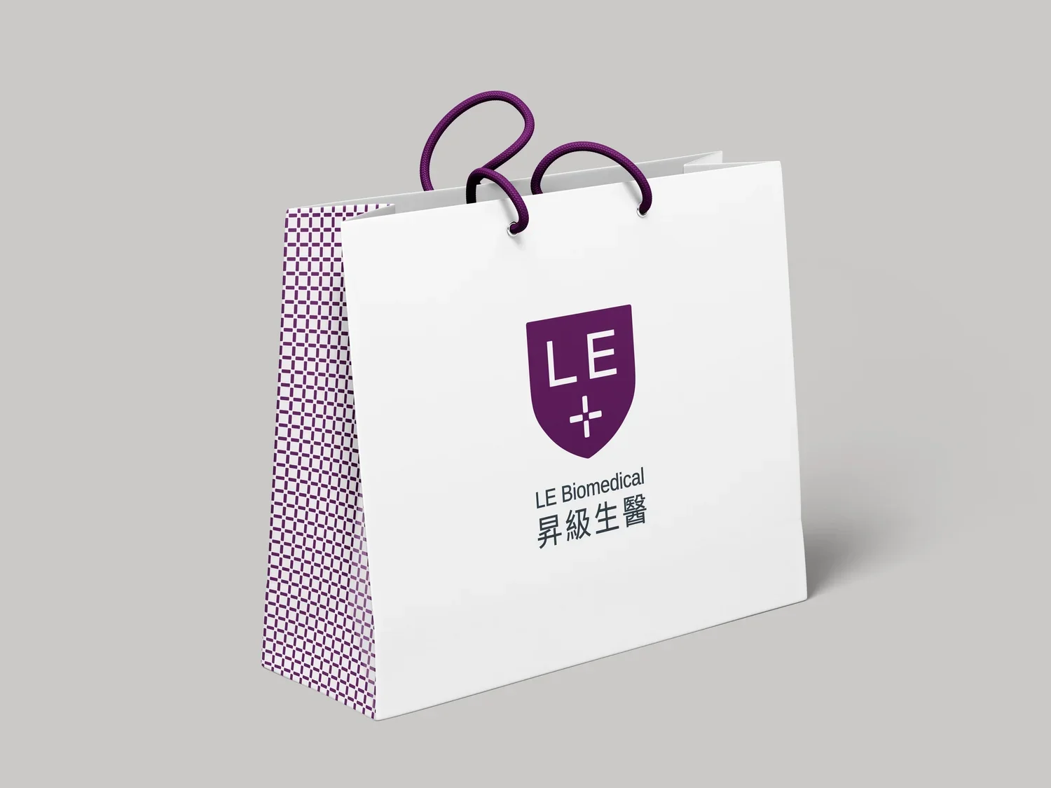
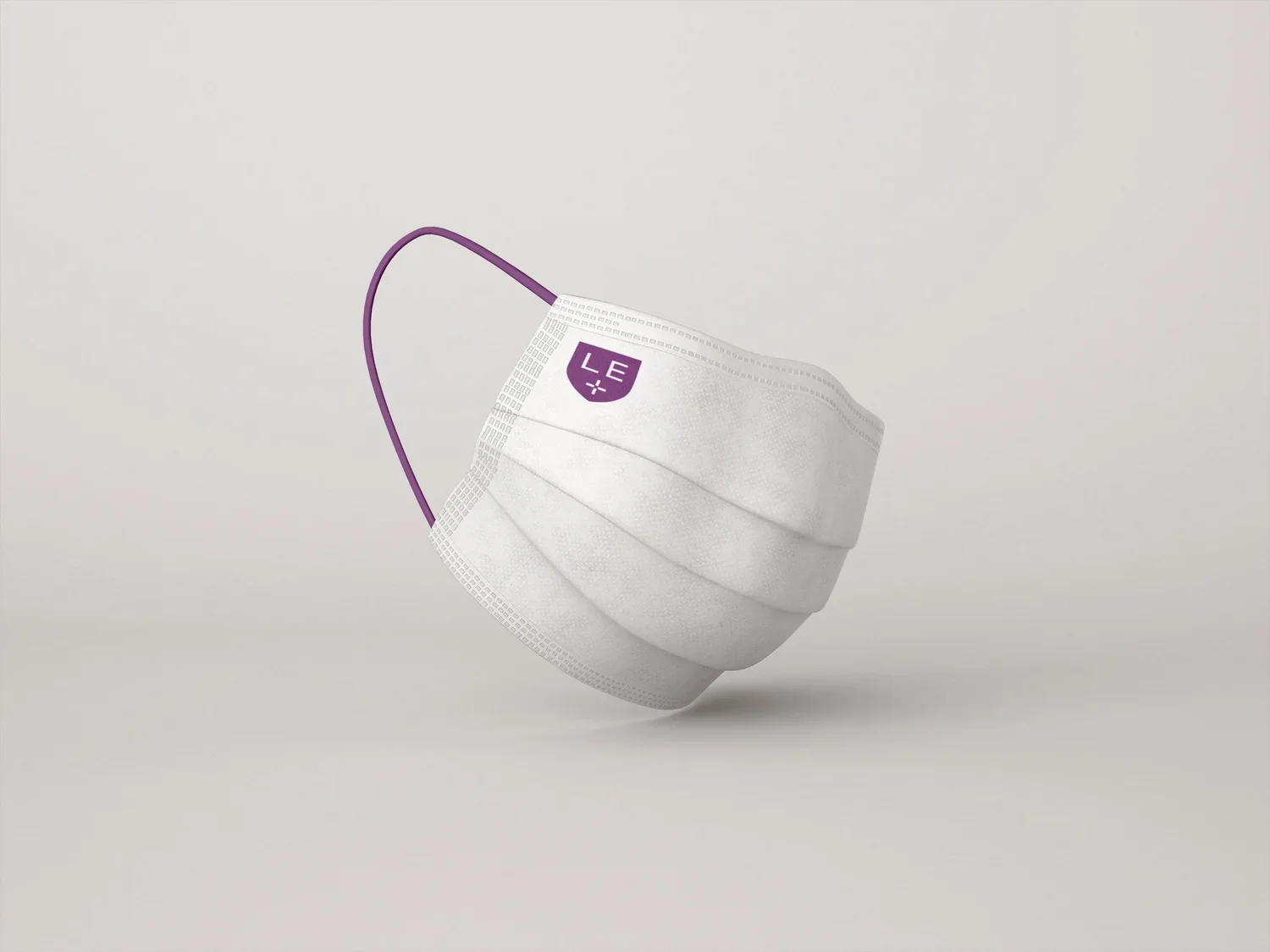
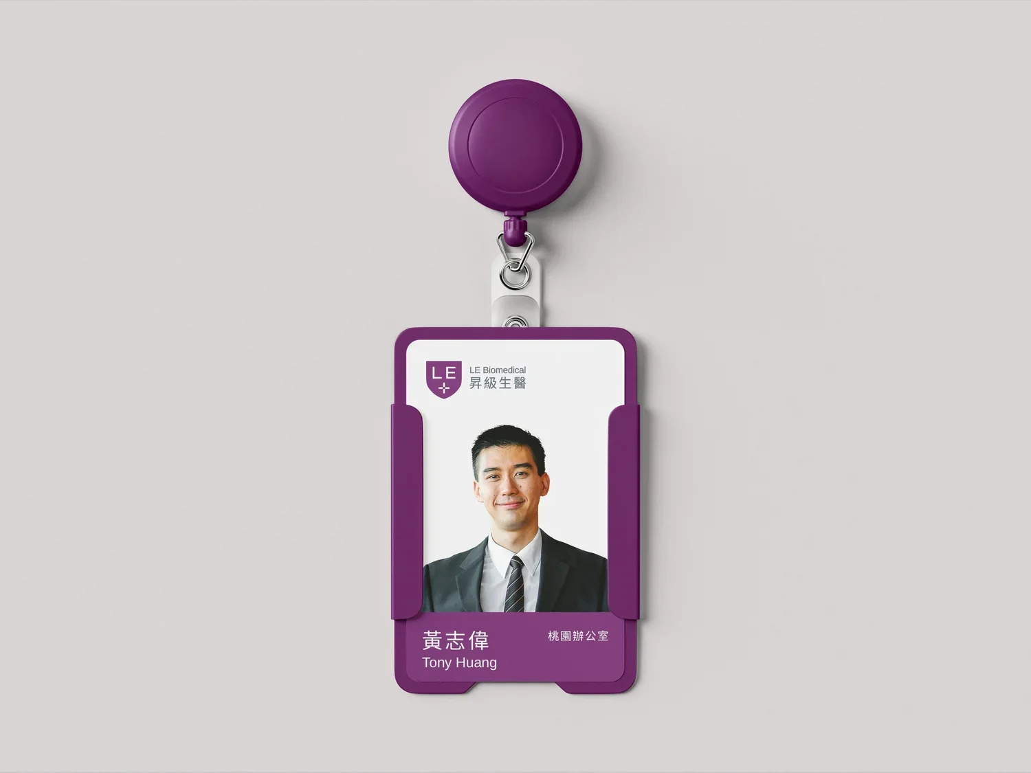
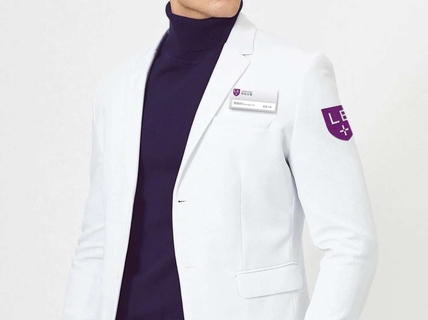
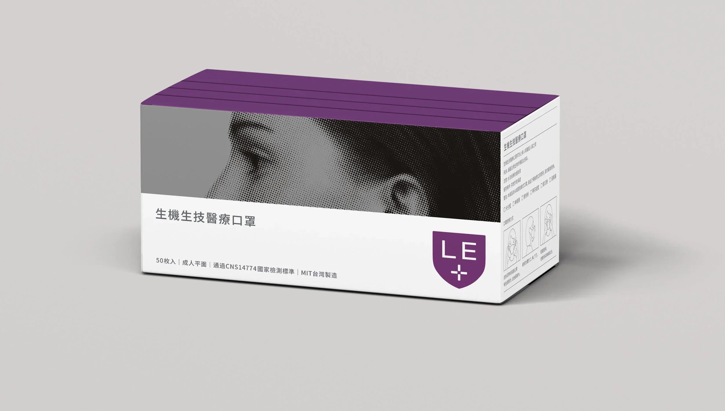
The system was applied across medical masks, packaging, uniforms, business cards, factory and office signage, exhibition materials, and operational assets.
Consistent color, graphic, and layout principles connected these applications into one expandable brand language, enabling LE Biomedical to maintain a coherent corporate image within a rapidly changing market while supporting future products and cross-sector applications.
Art Direction: DM
Design: DM & Ang Bai
Client: LE Biomedical Corp.
Design Agency: EQUALZ DESIGN
LE Biomedical(昇級生醫)成立於 2019 年 COVID-19 疫情期間,品牌聚焦於新一代生物防護技術與感染風險控制,從醫療口罩、抗病毒熔噴不織布等防護材料出發,進一步探索技術在醫療、交通載具及公共空間等不同環境中的應用。
隨著全球防疫需求快速上升,品牌不僅需要向企業客戶與國際市場清楚傳達技術能力,也需要建立足以延伸至生產、銷售及展示現場的完整形象。因此本專案的核心任務不是單純設計一個醫療品牌標誌,而是為一間處於快速發展階段的 B2B 生醫企業,建立具備專業可信度、技術辨識度與跨場域一致性的品牌識別系統。
設計策略與概念
生醫與防護技術涉及高度專業的研發及製造流程,設計需要在「醫療安全」與「科技創新」之間建立平衡,同時品牌識別必須能夠適應包裝、制服、工廠、辦公空間與國際展會等尺度和使用條件差異極大的接觸點。
品牌識別以「Protection through Technology/以科技建立防護」為核心概念,從口罩的立體輪廓與盾牌所象徵的安全防護出發,發展出簡潔、穩定且具有包覆感的視覺符號。幾何化的造型呼應生醫研發的精準與理性,向內收合的結構則傳達過濾、阻隔與守護的功能意象。
整體視覺採用清楚的資訊層級、模組化編排與一致的幾何語言,將抽象的生物防護技術轉化為容易辨識與延伸的品牌系統。設計沒有停留在常見的醫療符號,而是透過結構、比例與留白建立品牌自身的專業性,使其能同時面向企業採購、技術合作夥伴及國際市場。
品牌系統延伸
識別系統進一步應用於口罩及產品包裝、員工制服、名片、辦公與工廠標示、展覽物料及日常營運用品,使品牌從對外展示延伸至實際的生產與工作環境。
透過一致的色彩、圖形與版面規則,不同媒介不再是各自獨立的設計項目,而是共同形成一套可持續擴充的品牌語言。這讓 LE Biomedical 即使處於快速變動的疫情市場中,仍能維持清楚且穩定的企業形象,並為後續產品與跨領域應用保留發展彈性。