Sushi Samurai Brand Identity
Sushi Samurai is a reservation-only Japanese kappo restaurant where Chef A-Zhong creates personalised menus based on seasonal ingredients, individual preferences, and dining budgets. Rather than offering a fixed menu, the restaurant centres on the chef’s understanding of ingredients, the rhythm of each course, and direct interaction with guests, making every dining experience distinct and responsive to both person and season.
The project established a contemporary brand identity system that translates the chef’s craftsmanship, culinary precision, and the restaurant’s understated atmosphere into a cohesive visual and spatial experience.
Design Strategy & Concept
Black and white form the primary visual language. The restrained palette and precise compositions reflect the emphasis Japanese kappo places on ingredients, technique, and attention to detail. Rather than relying on an accumulation of conventional Japanese motifs, the identity uses whitespace, proportion, and materiality to create a composed and contemporary character.
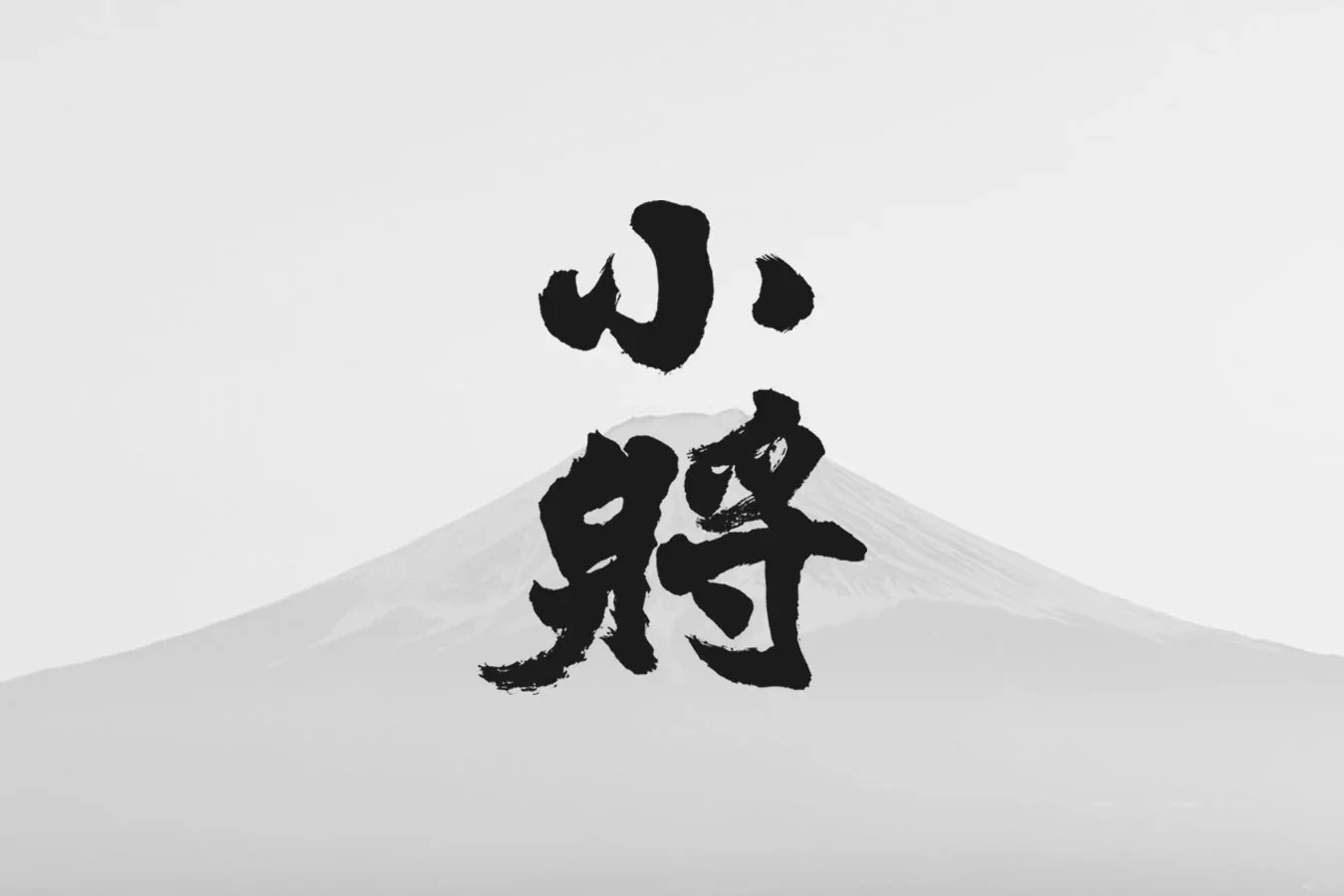
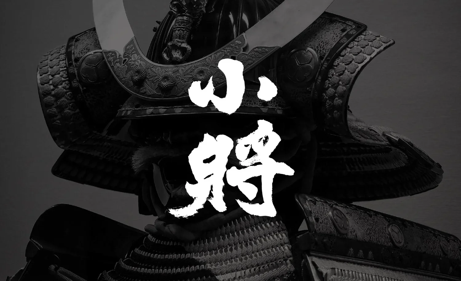
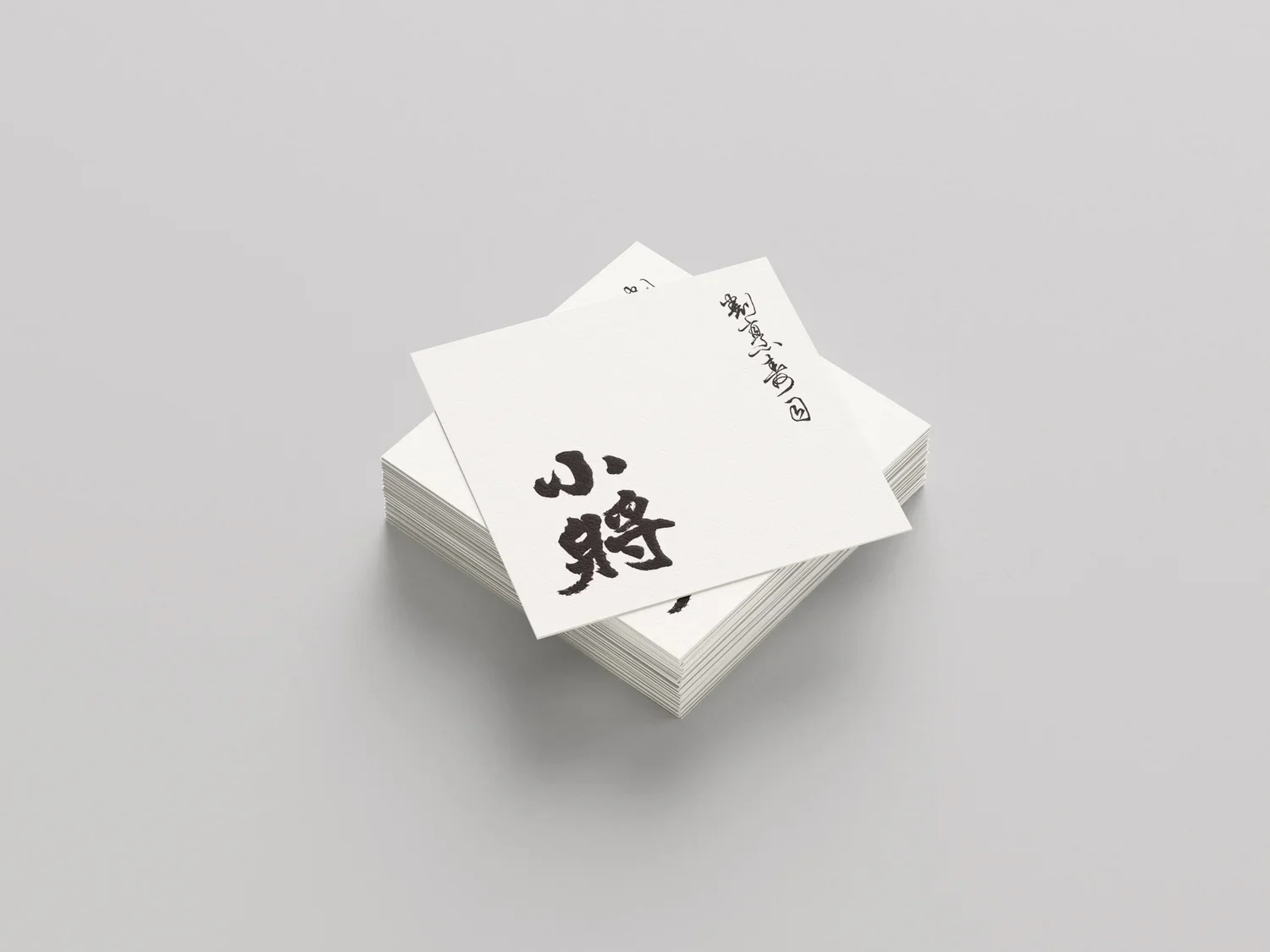
The custom typography incorporates the strength and rhythm of calligraphic brushwork. Variations in line weight, movement, and transition echo the chef’s precise yet fluid handling of ingredients. Its handwritten quality also preserves a sense of human warmth, giving the identity a distinctive artisanal character.
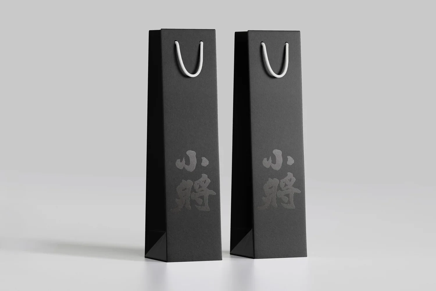
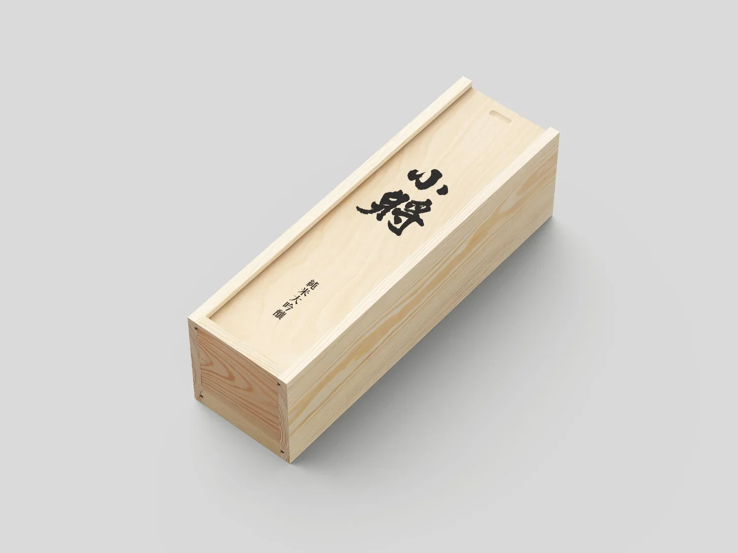
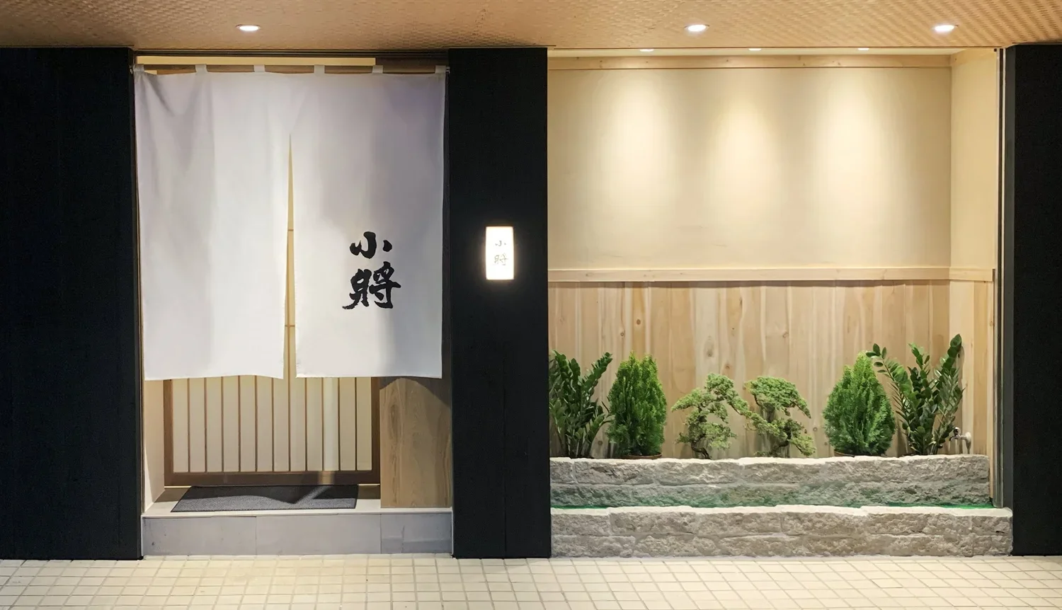
The visual system extends across thick-stock business cards, tactile printed materials, custom noren curtains, and tailored uniforms. Consistent use of paper, fabric, print, and spatial applications creates a coherent brand atmosphere throughout the customer journey, from making a reservation and arriving at the restaurant to the dining experience itself.
Beyond establishing the restaurant’s visual identity, the project uses typography, materials, and physical touchpoints to translate Japanese cultural references, craftsmanship, and the spirit of hospitality into an intuitive brand experience.
Design: Ann Bai
Client: Sushi Samurai Kappo
小將是一間採完全預約制的日式割烹料理餐廳,由阿忠師依據當季食材、顧客偏好與用餐預算,規劃專屬的料理內容。憑藉私密的用餐環境與高度客製化的料理體驗,小將亦成為香港、日本及台灣藝人私下造訪的預約制餐廳。相較於固定菜單,餐廳更重視廚師對食材的理解、料理節奏與現場互動,讓每次用餐都成為因人、因時而異的體驗。本專案為餐廳建立具有現代感的品牌識別系統,將職人的手藝、料理的精準度與內斂細緻的用餐氛圍,轉化為一致的視覺與空間體驗。
設計策略與設計概念
品牌以黑白作為主要視覺語言,透過克制的色彩與清楚的構圖,呼應日式割烹對食材本質、技術與細節的重視。簡潔的視覺表現不刻意堆疊日式符號,而是以留白、比例與材質建立沉穩而具有當代感的品牌形象。
品牌字體融入書法筆觸的力量與節奏,以線條的收放、粗細與轉折,對應廚師處理食材時精準而流暢的動作。手寫感也保留了料理中屬於人的溫度,使品牌在專業與細膩之外,仍能呈現鮮明的職人性格。
視覺系統進一步延伸至厚磅名片、具纖維觸感的印刷品、訂製暖簾與工作制服。透過紙材、布料、印刷與空間應用的一致整合,讓顧客從預約、抵達餐廳到實際用餐,都能感受到連貫而精緻的品牌氛圍。
除了建立餐廳的視覺形象,也藉由字體、材質與實體接觸點,將割烹料理所重視的日式符號、手藝與款待精神,轉化為直覺的品牌體驗。