Palais de Chine Hotel Artbrosia Signage design
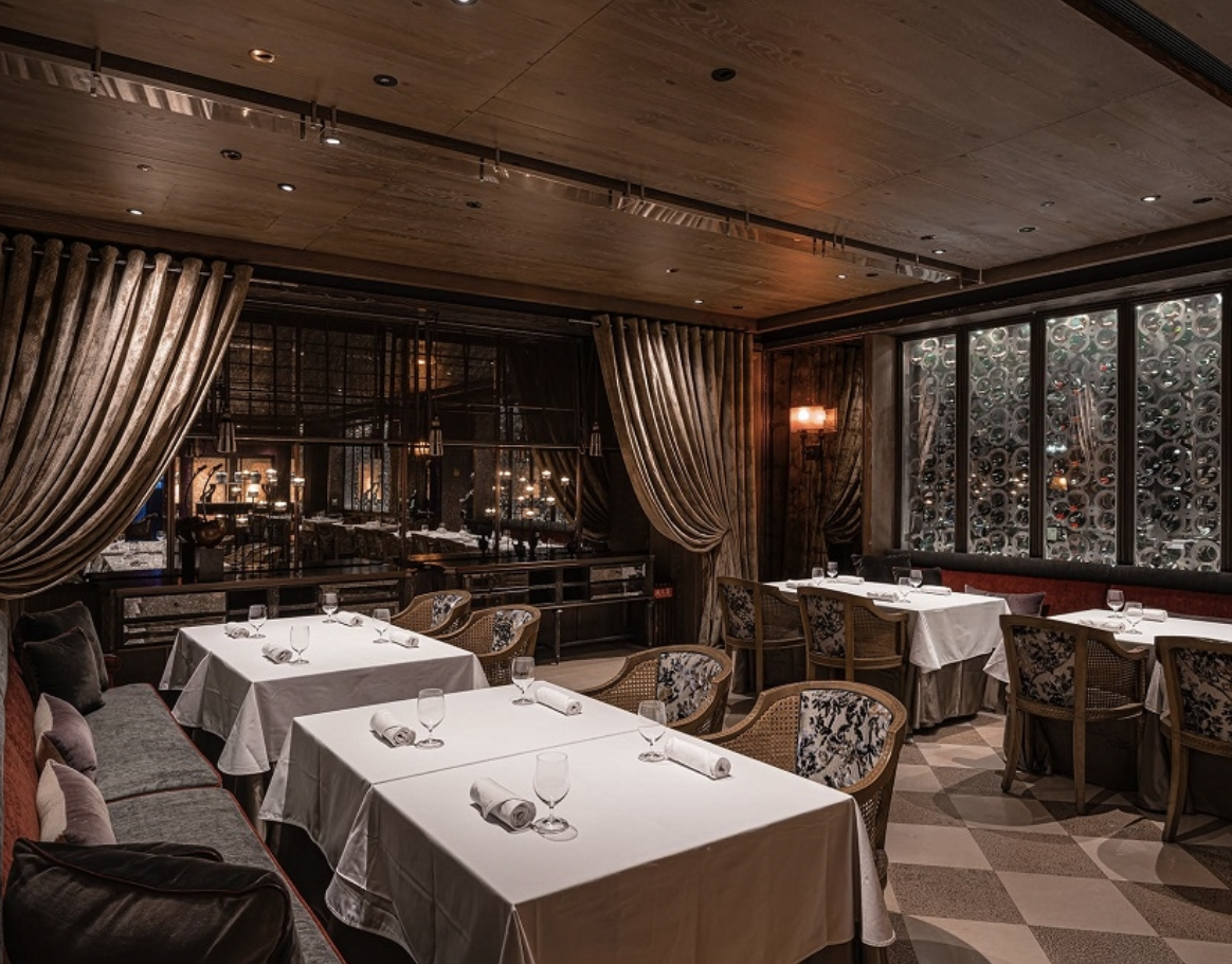
Artbrosia is an Italian restaurant located within Palais de Chine Hotel in Taipei, known for its authentic Italian cuisine, refined service, and sophisticated dining atmosphere. The restaurant was recommended by the Michelin Guide Taipei in 2021.
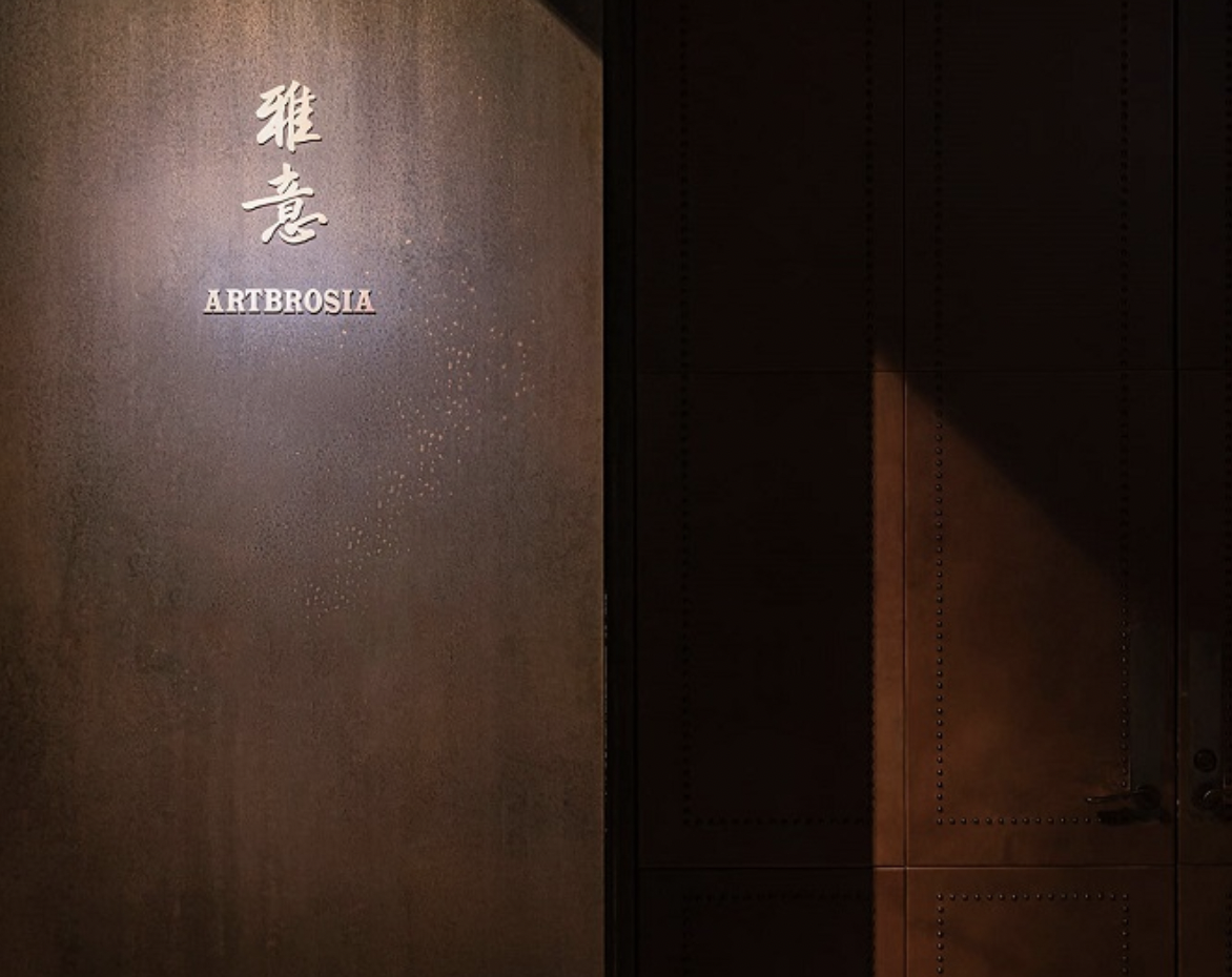
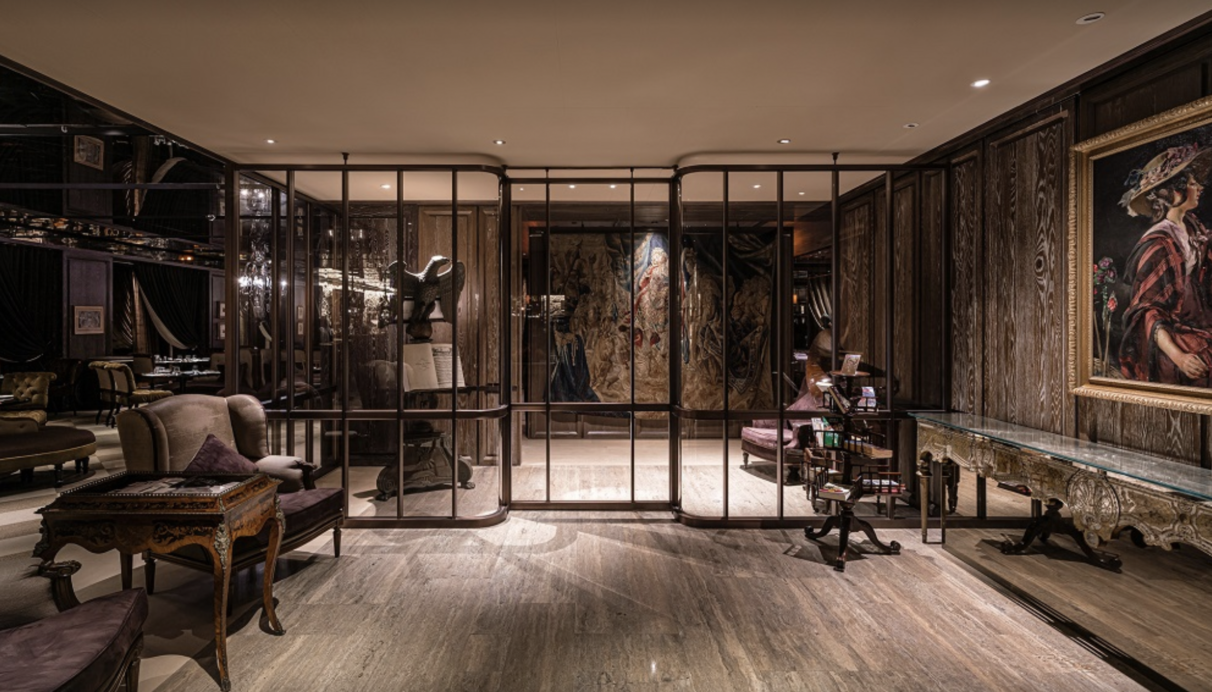
Developed in dialogue with the interior designed by Ray Chen, the project focused on signage and typographic design that translated Artbrosia’s artistic character and fine dining experience into a distinctive spatial identity. Beyond communicating the restaurant’s name and wayfinding information, the signage was designed to connect naturally with the architecture, materials, and interior atmosphere.
Design Strategy & Concept
The signage centres on elegant typography inspired by the rhythm, movement, and use of negative space found in Chinese calligraphy. The proportions and spatial structure of the letterforms were refined to preserve the warmth of handwriting while introducing a contemporary quality suited to an Italian fine dining environment.
The original calligraphy draft was further developed into a consistent typographic system, ensuring clarity across different scales, materials, and viewing distances. The controlled movement and spacing of the characters reflect the restaurant’s composed and understated atmosphere, creating a subtle dialogue between Eastern calligraphic expression and Italian dining culture.
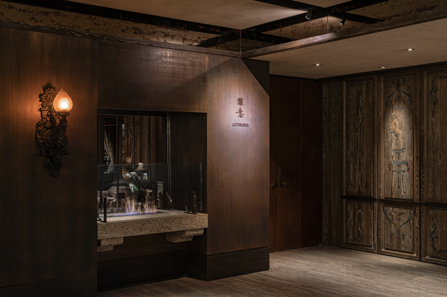
The design extends across the entrance signage and related environmental applications, with scale and placement adjusted in response to the interior materials, lighting, and customer journey. Through the integration of typography, materiality, and spatial detail, the signage becomes more than functional information—it connects the restaurant’s artistic identity with its architectural setting and dining experience.
Design: Ann Bai
Calligraphy Draft: Bruce Du
Client: Palais de Chine Hotel
Design Agency: EQUALZ DESIGN
Interior Design: Ray Chen 陳瑞憲
Photo Credit: Palais de Chine Hotel, EQUALZ DESIGN
Artbrosia 是位於台北君品酒店內的義大利餐廳,以正統義式料理、精緻餐飲服務與細膩的空間氛圍為特色,並於 2021 年獲《臺北米其林指南》推薦。
本專案聚焦於餐廳標示系統與字體設計,配合陳瑞憲設計的室內空間,將餐廳的藝術氣質與高端用餐體驗轉化為具有識別度的空間文字。設計不只是傳達餐廳名稱與導引資訊,也需要成為建築、材質與室內氛圍之間自然銜接的一部分。
設計策略與設計概念
標示設計以具有東方書寫韻味的優雅字體為核心,從中文書法的筆勢、節奏與留白關係汲取靈感,重新調整字形比例與空間結構,在保留手寫溫度的同時,建立適合當代義式餐飲空間的精緻感。
書法字稿經設計後,使筆畫在不同尺寸、材質與觀看距離下仍能維持清楚的識別度。字體的收放與空間節奏也呼應餐廳沉穩、細膩而不張揚的用餐氛圍,讓東方書寫形式與義大利餐飲文化形成含蓄而具有張力的對話。
設計進一步延伸至入口招牌與相關空間標示,並依據室內材質、光線及視線動線調整比例與設置方式。透過字體、材質與空間細節的整合,標示不再只是附加於環境中的資訊,而是連結餐廳藝術形象、建築氛圍與顧客體驗的重要元素。