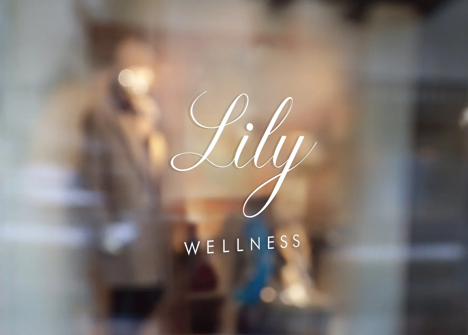
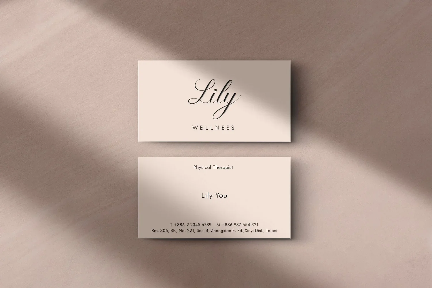
Lily WELLNESS Brand Identity
Lily Wellness is a wellness studio offering private yoga sessions and integrative therapies in a calm and reassuring environment. Its services help clients slow down, reconnect with their bodies, and restore a sense of physical and emotional balance.
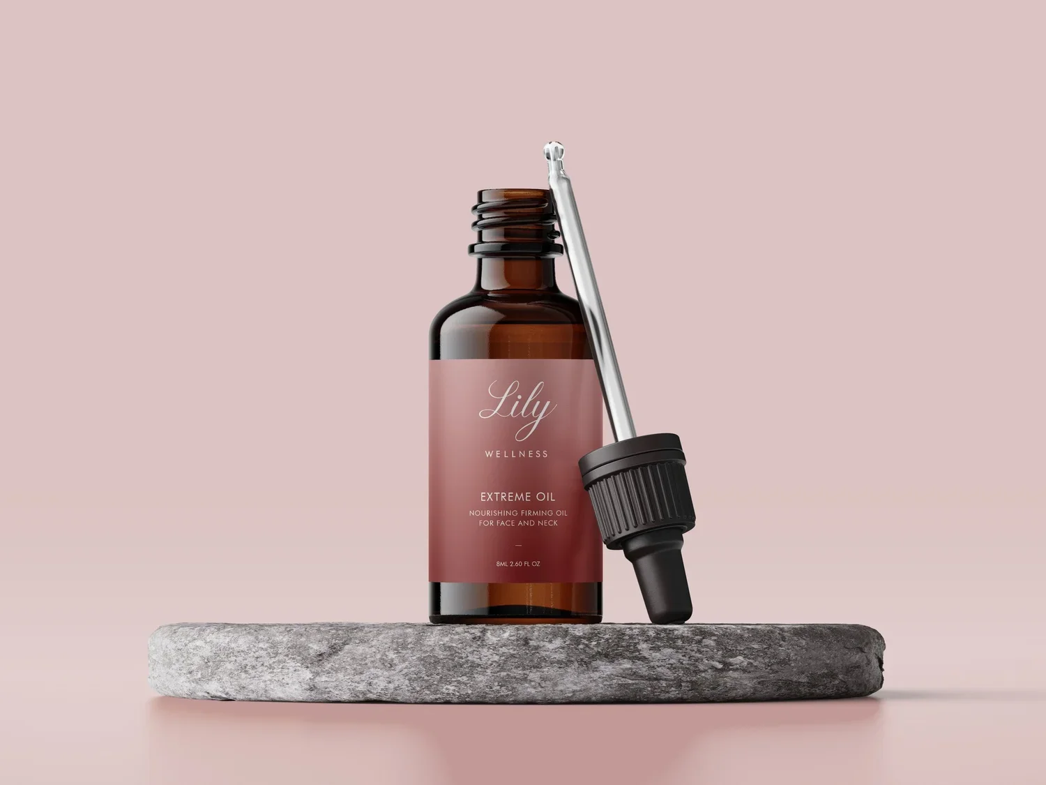
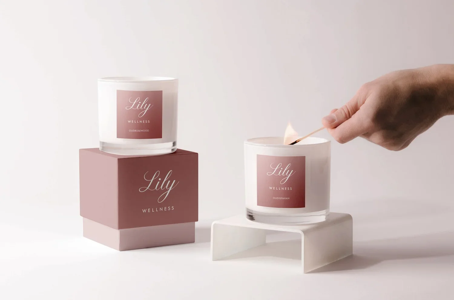
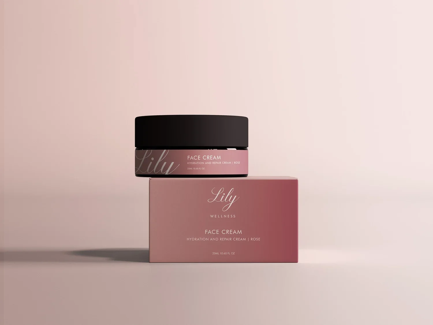
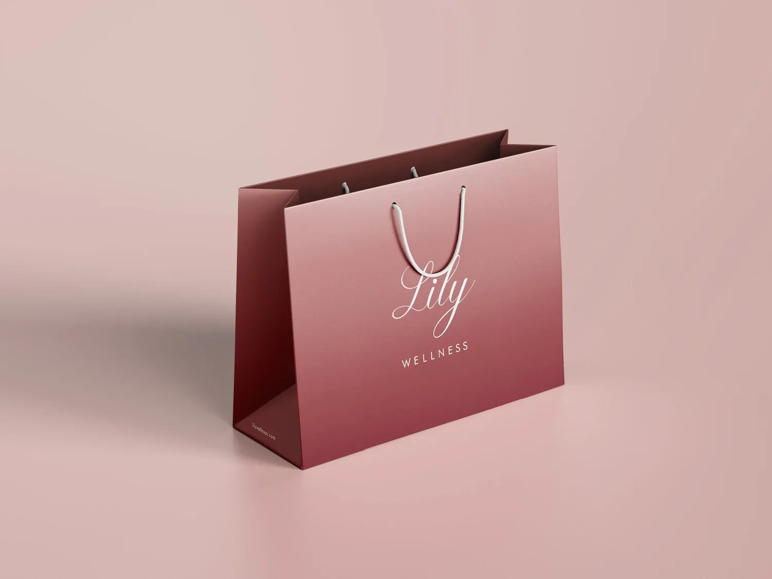
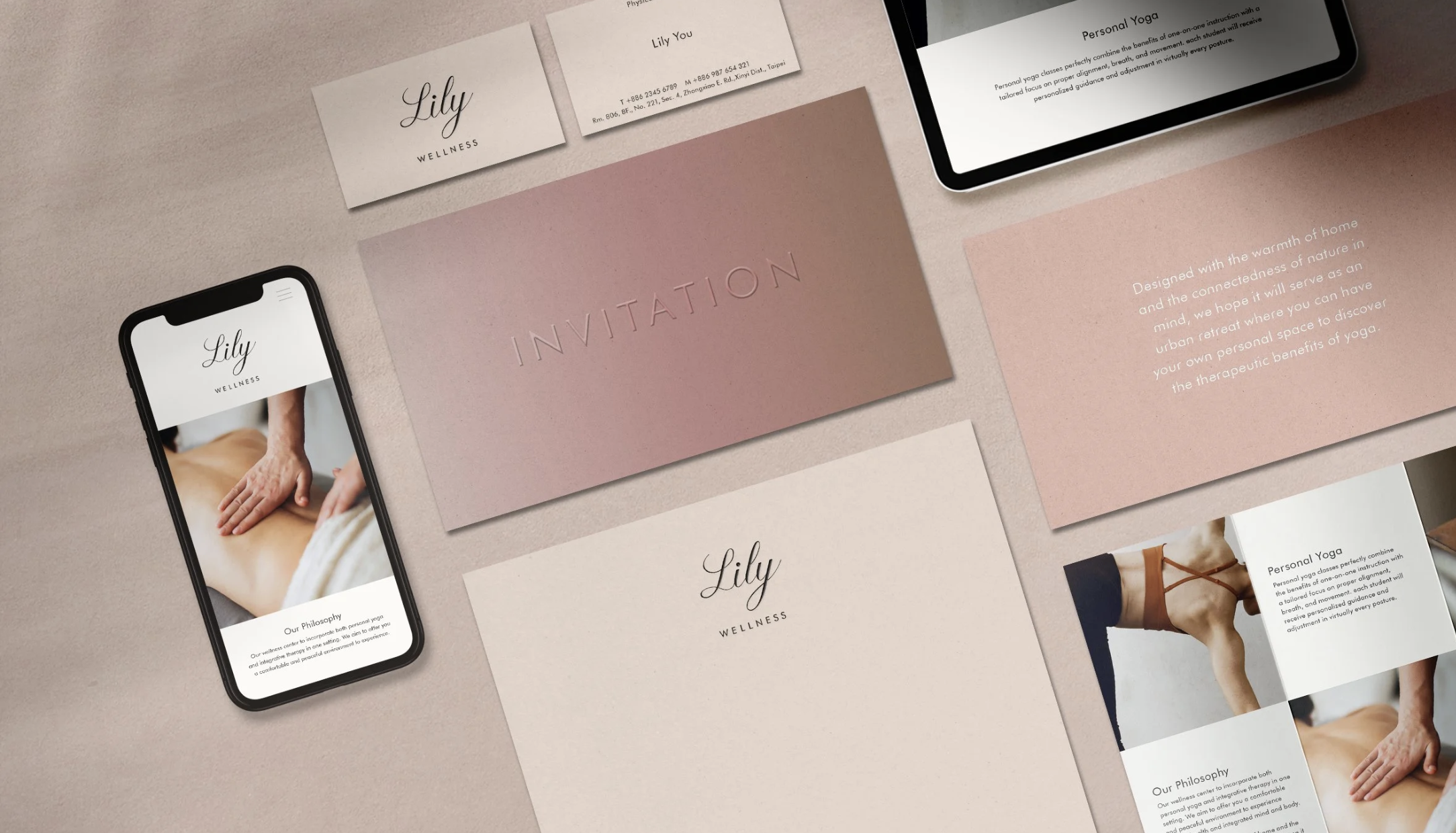
The project established a complete visual identity and packaging system rooted in the studio’s core philosophy. Beyond communicating its professional services, the design translates its warm, natural, and body-centred approach into a sensory brand language with a distinct emotional quality.
Design Strategy & Concept
The identity is built around the concept of “the warmth of healing hands.” It was inspired by the therapist’s observation that experienced practitioners naturally maintain warmth in their palms during treatment. This warmth, transferred through touch, became a central symbol of trust, connection, and restoration.
Designed primarily for a female audience, the visual language avoids an overly clinical or functional aesthetic. Instead, soft, fluid, and sensory elements create a peaceful and comforting atmosphere in which clients can feel at ease.
The colour system uses warm gradients ranging from natural skin tones to soft pinks, representing the body gradually regaining warmth and circulation during therapy. The gentle transition between colours also evokes breathing, energy, and subtle changes in the body.
The custom typography draws inspiration from the movement of a therapist’s hands. Its flowing forms and continuous lines convey touch, rhythm, and softness. This visual language extends across the identity, packaging, and related applications, creating a consistent expression of Lily Wellness’s warm, natural, and body-centred approach.
Art Direction & Design: Ann Bai
CL: Lily Wellness
Lily Wellness 是一間提供私人瑜伽與整合式身心療癒服務的健康工作室,透過安靜而具有安全感的空間,協助來訪者放慢身體節奏,重新感受身心的平衡與放鬆。
本專案從品牌核心概念出發,建立完整的視覺識別與包裝系統。設計不只需要傳達工作室的專業服務,也希望將療程中溫和、自然且以身體感受為核心的體驗,轉化為具有觸覺與情緒溫度的品牌語言。
設計策略與設計概念
品牌識別以「療癒雙手的溫度」為核心概念,源自療癒師對身體與觸碰的觀察:具有豐富經驗的療癒工作者,在進行療程時,掌心往往會自然維持溫暖。這份透過雙手傳遞的溫度,成為品牌連結身體、信任與修復感受的重要象徵。
針對以女性為主的客群,整體視覺避免過度醫療化或強調機能的表現方式,改以柔和、感性且具有流動感的設計語言,營造平靜、舒適而能夠安心停留的氛圍。
色彩系統運用從自然膚色延伸至柔和粉色的暖色漸層,象徵身體在療程中逐漸恢復溫度與循環的過程。色彩之間自然流動,也呼應呼吸、能量與身體狀態緩慢轉變的感受。
品牌標準字則從療癒師雙手的移動軌跡汲取靈感,以柔和、連續且富有節奏的線條,呈現觸碰與流動感。這套視覺語言進一步延伸至品牌識別、包裝及相關應用,使每個接觸點都能傳達 Lily Wellness 溫暖、自然且以身體為核心的療癒體驗。