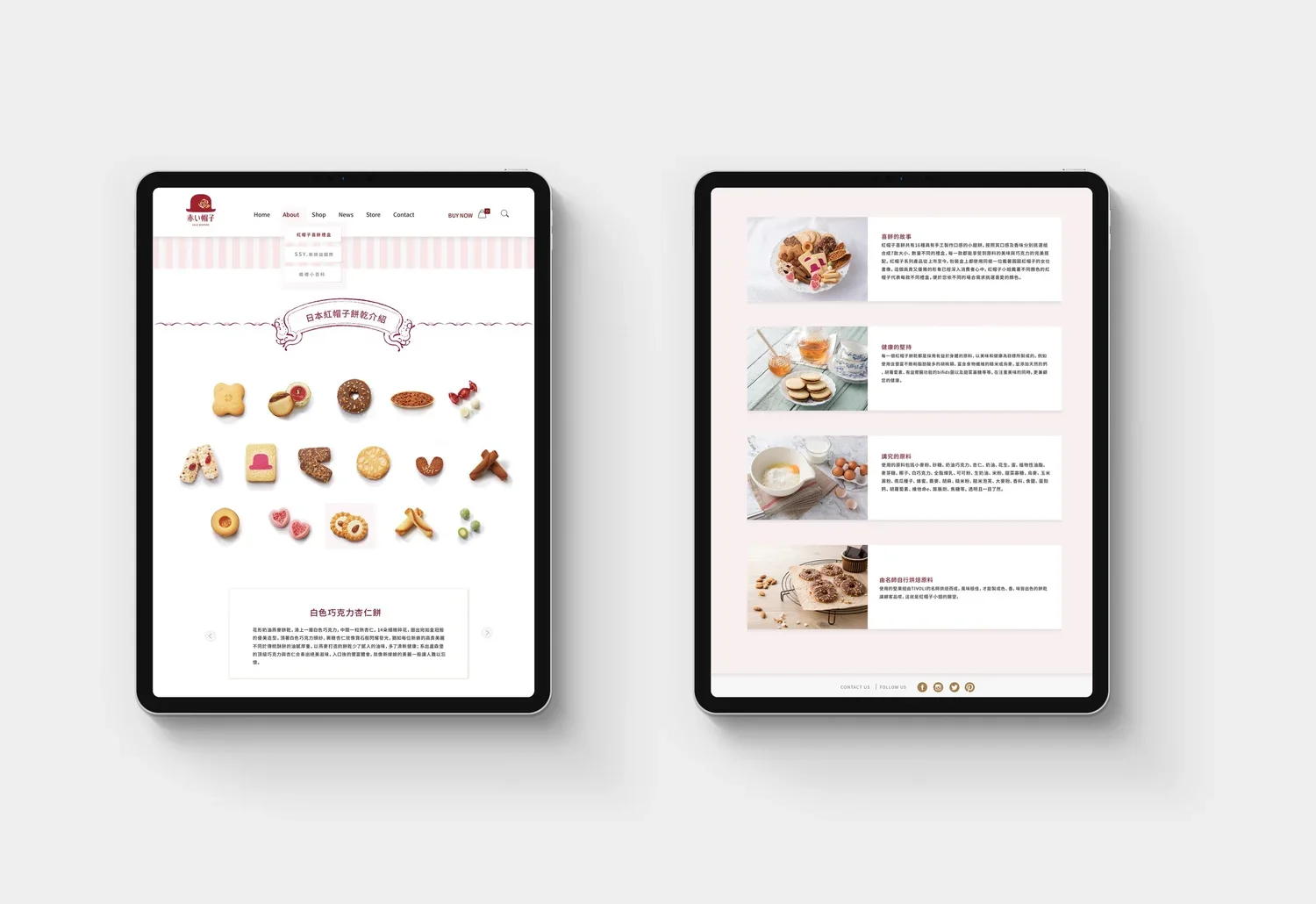
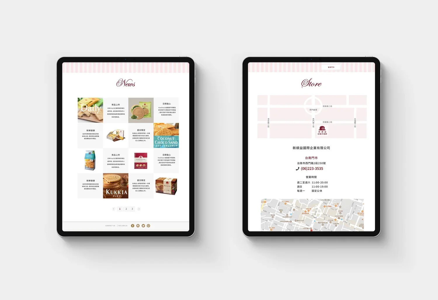
AKAI BOHSHI & SSY Website design and content writing
AKAI BOHSHI is a well-established Japanese confectionery brand recognised for its assorted cookie gift boxes and distinctive “girl in the red hat” identity. Founded in 1989, SSY International is a major Taiwanese distributor of the AKAI BOHSHI product range produced by TIVOLI Co., Ltd.
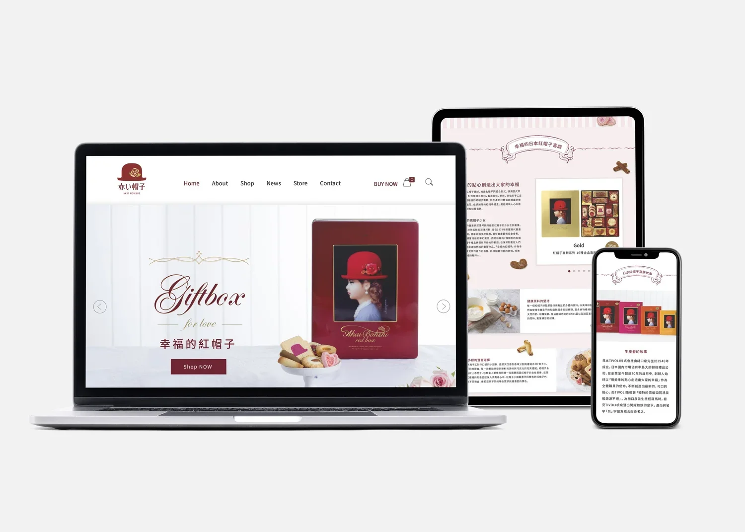
The project restructured the existing website to communicate the brand story, product offering, and SSY International’s role more clearly. Brand information, product collections, retail locations, news, and e-commerce functions were integrated into a cohesive digital platform.
Encompassing content writing, user experience design, product photography, and interface design, the project translated the refined character of the Japanese brand into a digital experience suited to Taiwanese consumers while establishing a renewed corporate image for SSY International.
Design Strategy & Concept
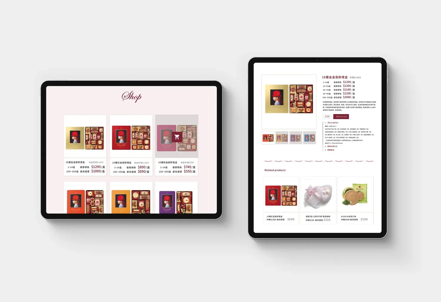
The key challenge was to balance AKAI BOHSHI’s established identity, SSY International’s role as its Taiwanese distributor, and the functional requirements of e-commerce. The website reorganised the brand story, product categories, specifications, purchasing information, and retail channels around a clear and intuitive customer journey.
The content strategy presented products through gifting occasions, seasonal celebrations, and everyday moments of enjoyment, strengthening the emotional value of the brand beyond basic product information. A modular structure also allows products, campaigns, and news to be updated consistently over time.
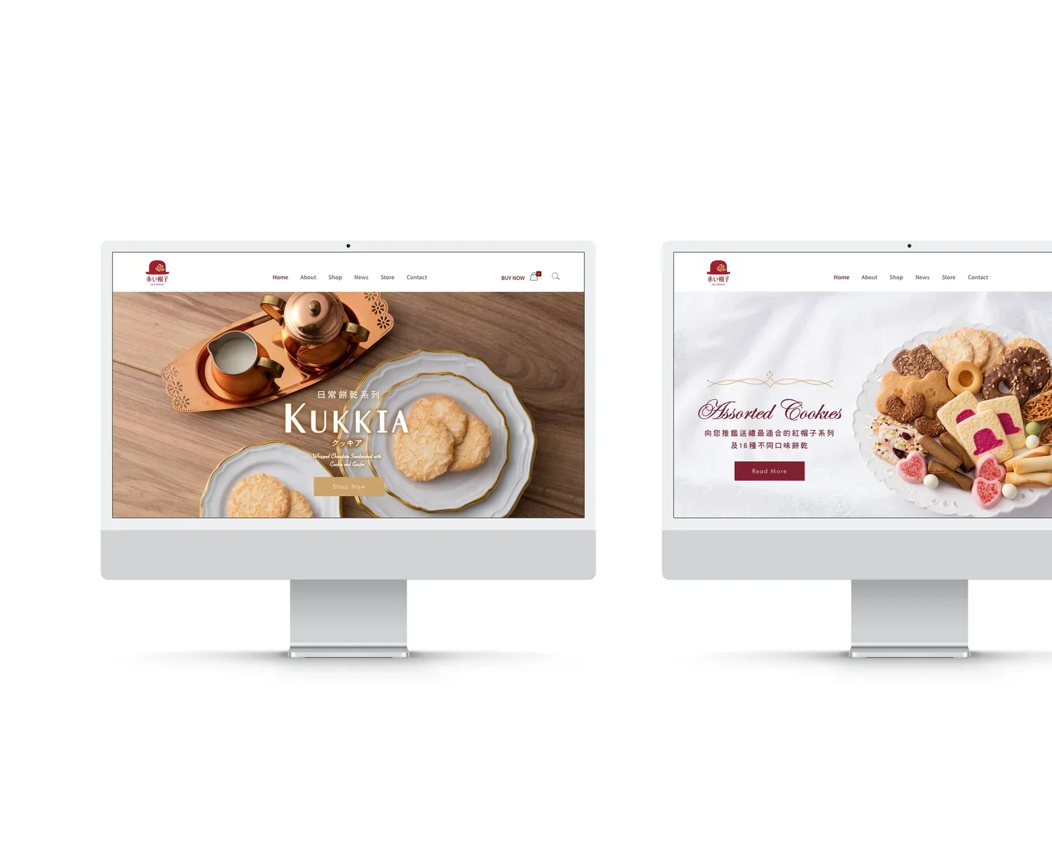
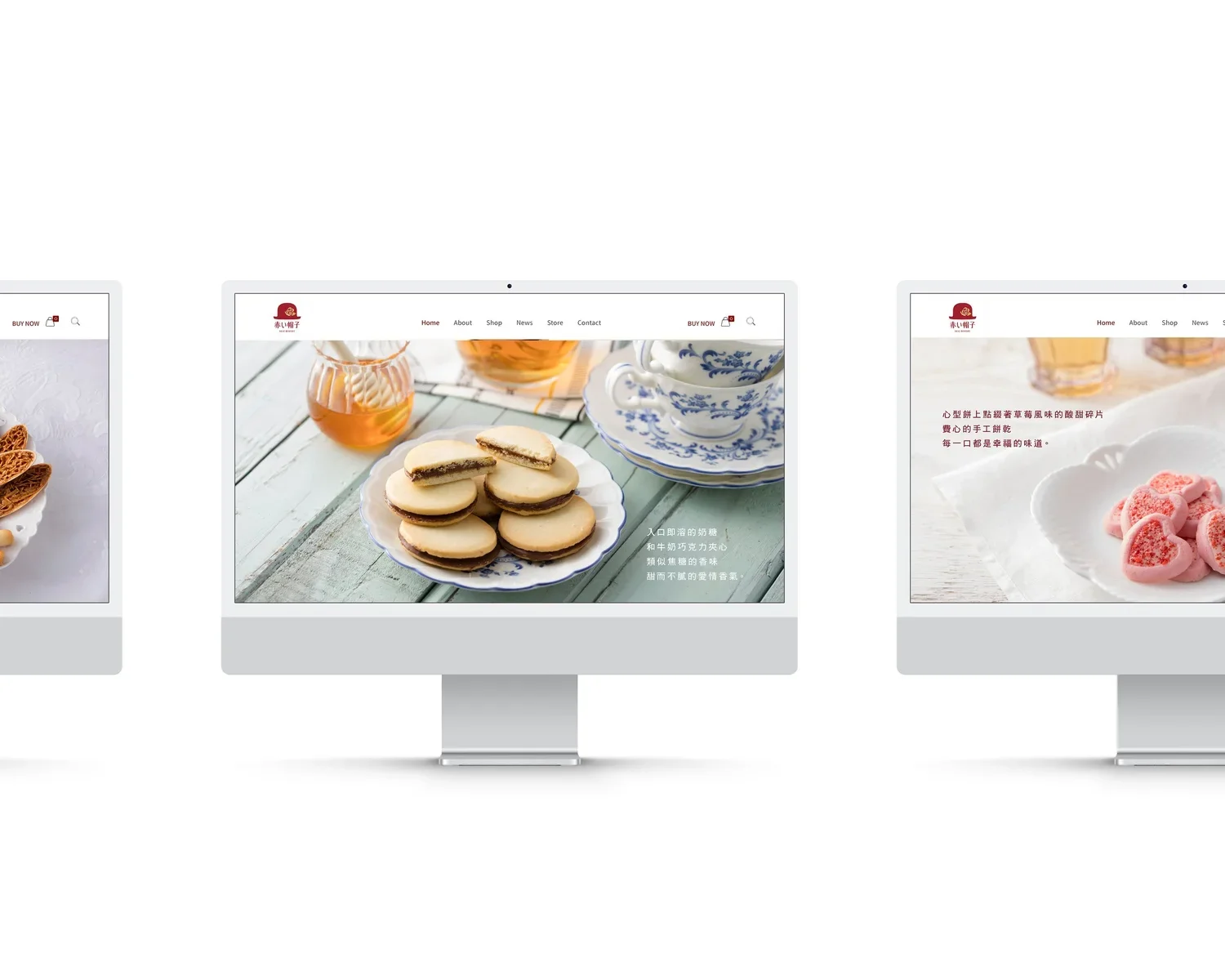
The visual design extends AKAI BOHSHI’s signature red and elegant character through soft pink tones, generous whitespace, and delicate decorative details. Product photography combines confectionery with tea settings and tableware, creating a refined gifting and tasting experience.
Responsive layouts adapt the content hierarchy and shopping experience across desktop, tablet, and mobile devices. By integrating content, photography, user experience, and interface design, the project transformed the distributor’s website into a cohesive platform for brand communication and online sales.
Art Direction & Design: Ann Bai
Photographer: LUO DUN CIANG, SSY.
Client: 新順益國際 X 赤い帽子 AKAI BOHSHI
Design Agency: EQUALZ DESIGN
Web hosting service: NSS GROUP
赤い帽子(AKAI BOHSHI)為日本具代表性的西式糕點品牌,以精緻的綜合餅乾禮盒與鮮明的紅帽女孩形象廣為人知。新順益國際成立於 1989 年,是日本 TIVOLI 集團「赤い帽子」系列產品在台灣的重要代理商,長期負責品牌引進、銷售及市場推廣。
隨著產品線與數位銷售需求持續發展,原有網站已難以完整呈現品牌故事、商品特色及新順益國際的企業角色。因此,本專案重新規劃網站架構與整體內容,整合品牌介紹、產品資訊、銷售通路、最新消息及線上購物功能,建立兼具品牌溝通與產品銷售功能的官方網站。
專案涵蓋內容撰寫、使用者體驗設計、產品攝影與介面設計,將日本品牌原有的精緻形象轉化為更符合台灣市場閱讀與消費習慣的數位體驗,同時為新順益國際建立清楚而完整的企業形象。
設計策略與設計概念
此案設計的核心挑戰在於「日本原有品牌識別」、「台灣代理商的企業角色」與「電子商務使用需求」之間建立一致的溝通架構。網站以消費者的選購歷程為基礎,重新整理品牌故事、商品系列、產品規格、購買資訊與實體通路,讓使用者能快速理解品牌特色,並順暢地完成商品瀏覽與購買。
內容策略著重於將產品資訊轉化為更具情境與情感連結的品牌敘事。除了說明不同系列的口味、規格與包裝特色,也透過送禮、節慶與日常品味等使用情境,傳達赤い帽子作為日本精緻糕點禮盒的品牌價值。模組化的商品與內容架構則讓品牌能持續更新產品、節慶企劃與最新消息,同時維持整體資訊的一致性。
視覺設計延續赤い帽子品牌本有的經典紅色識別色,及優雅、浪漫的品牌氣質,針對目標客群搭配柔和粉色、留白及細緻的裝飾線條,建立輕盈而精緻的網站氛圍。產品攝影以茶點、器皿與日常送禮情境呈現商品,使不同種類的餅乾不只作為單一產品被觀看,也能讓消費者想像其實際品嚐與贈禮體驗。
響應式介面則針對桌面、平板與手機調整內容層級、商品排列與操作方式,確保品牌故事、產品資訊及購物流程在不同裝置上皆清楚易用。透過網站架構、內容、攝影與介面設計的整合,本專案將原有的產品代理網站轉化為兼具品牌形象、內容溝通與銷售功能的數位平台。